Saturday, December 6, 2008

Quilting in the Wind


Quilt No. 62
July 2008

This quilt was inspired by a session of fabric dying that took place under less than ideal circumstances. A friend had given me a magazine that outlined a dying technique where strips of tissue paper are placed on damp fabric. Setacolor fabric dye is then painted over the strips, and the dyes from the tissue paper and the Setacolor run together to create interesting patterns. The process is done outdoors, as Setacolor dye is light sensitive.

I set up my work area on a table on the deck of our cottage. I was very enthusiastic about trying this new technique, so I ignored the fact that it was a very hot and windy day. Dying fabric with Setacolor paints requires limited air movement and high humidity to allow time for the dye to spread out slowly before it dries. However, as the wind blew fiercely, the tissue paper strips kept blowing off the fabric. The fabric kept losing its required dampness, so I didn’t chase the strips, I just kept spraying the fabric with water and adding new strips of tissue paper and more fabric dye. Eventually, I left the project to dry in the sun. As I made my way around the corner of the deck a new vista greeted me. All the strips that had blown away were hanging in the trees – in effect, I had “toilet papered” my own trees with messy strips of dye-laden tissue paper. When I related these events to my friend, she immediately suggested this would make a good subject for a quilt. Her comments became the inspiration for Quilting in the Wind. The tissue paper dyed fabric was used in the quilt entitled, Uncharted.


Quilting Notes


Although I tested several brands of tissue paper it was all dye-fast, and did not release any dye. It did however causing varying effects by blocking the sunlight to different degrees in different areas. The design of the tree trunk was “borrowed” from a drawing on the internet, but I drew the branches and leaves. A small amount of fabric was dyed to create contrast near the base of the tree. Purchased “transition fabrics” were used to get the gradations in colour for the sun and the pink strips.

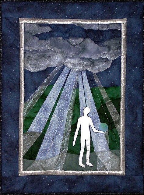
Let It Be

In Let it Be we see a figure holding the planet Earth in his hand.

Despite the cloudiness of the night sky, beams of light break through.

In his famous song, Let It Be, Paul McCartney wrote

And when the night is cloudy
There is still a light that shines on me
.


Quilt No. 61
June 2008
McCartney wrote this song after a dream about his mother, Mary, who had died many years previously. In the dream, she soothed his tensions, advising him, “It will be alright, just let it be."
Often, during our darkest moments, someone will step in to shine a light and show us which way to go.

When we have learned to accept that there are limitations and situations beyond our control, we will have learned to let it be.

Is the figure divine? Is it human or alien? It’s up to the observer to decide.

What a world we could have, if we could learn to let it be.

Quilting Notes
I wanted to use some sheer material in this quilt as part of the beams of light. This proved to be exceptionally difficult, as various types of this fabric shredded along the raw edges when I tried to sew them on. Gluing them simply made a mess. The raw edges could not be turned under, as they would show. Eventually I found a fabric that could withstand stitching along the edge with invisible (nylon) thread. A different sheer fabric was layered over the star fabric to give a dreamy quality to the light beams. The central figure was put on and removed a number of times, as the tight curves and the thick material (two layers of cotton to hide any seam allowances that were turned under) made appliqué very challenging. The cloud and the figure were both painted with Setacolor Shimmer Pearl prior to being added to the quilt. When assembled, the quilt was much too dark. Additional Shimmer Pearl was painted on the finished quilt to give a much lighter look.

Waiting for Death


Quilt No. 60
June 2008

I noticed a crow was spending a lot of time in our back yard. Oddly, he didn’t fly away when I went out on the patio. He seemed to be injured, and began to spend his time sitting on the edge of the wishing well, gazing off into the distance. He could no longer fly and seemed resigned to his fate. I took a photo of the crow, knowing I would one day use it to create a quilt entitled Waiting for Death. His life seemed to parallel events in my family as my elderly mother declined and approached the final challenges of her life. The title seems bleak, but the crow is surrounded by tremendous beauty as he prepares to pass from this world to the next.


Quilting Notes

Black polyester-cotton was used for the appliqué of the silhouettes. One hundred percent cotton, particular black cotton, tends to be thick and coarse, and shreds along the raw edges, making it more difficult to use for appliqué. The cotton with polyester is smoother and thinner and gives finer edges that are more easily turned under. The background was dyed the Setacolor fabric dyes painted over tissue paper strips. A minimal amount of hand quilting has been added.


Friday, December 5, 2008

Crikey!


Quilt No. 59
February 2008


I have a message for my fans. Whatever you want to do in this world, it is achievable. The most important thing that I've found, that perhaps you could use, is be passionate and enthusiastic in the direction that you choose in life, and you'll be a winner.
- Steve Irwin, 1962 – 2006


It took a long time after conservationist Steve Irwin, the Crocodile Hunter, died on September 4, 2006 before I did this quilt in his honour. I’ve shown only his feet and legs plus a crocodile. This simplistic view of this passionate man is how I always think of Steve Irwin.

Quilting Notes

I probably looked at every one of the hundreds of pictures of Steve Irwin posted on the Internet when I was trying to find one that showed his feet in the position I had in mind. It needed to be clear enough to use as a template to make the fabric pieces for the boots. I searched a number of times over several weeks and came up with nothing that would be useful. I also looked at all kinds of pictures of work boots and hiking boots, but these weren’t right either. One day, I used “Crocodile Hunter” rather than “Steve Irwin” in a Google Images search, and found a picture of the Crocodile Hunter Action Figure. The feet were in the position I wanted and the details on the boots were very clear. I used this to create his boots and legs. The fabric for his legs was tea-dyed to give them a typical Australian tan. The green lawn he’s standing on was a piece of fabric I had dyed previously. It was the result of using up leftover powered plus liquid dye from an exploration that didn’t work out. Quite by accident, it was the right shade of green to match the fern and river fabrics in this quilt. The crocodile and fence fabric were in my stash, so it wasn’t necessary to purchase any new fabric for this quilt. The fence was also tea-dyed to give the original flat grey colour of the fabric the appearance of wood.

The outline of the crocodile came from the logo of an alligator that appeared on the plastic mailing envelope from a medical journal that I received at work. It was used to advertise an upcoming conference in Florida. I liked the outline of the alligator and kept it pinned up on my bulletin board for many years, with no particular use in mind. When I made the pattern, I narrowed the snout to make it look more like a crocodile.

The fence was added to bring things into focus by reducing the impact of all the green fabrics so they wouldn’t overwhelm the quilt. Every rail in the fence was outlined with embroidery floss. I used only one strand of brown for the top of the rails. The depth of shadow below the rails was increased by using two strands - one brown plus one strand of a red that matched the colour of the crocodile.

I made this quilt for my co-worker, Pierre, to thank him for all the hours he spent making and arranging the purchase of the business cards for Concept Quilts, and because Steve Irwin is one of his heroes, too.


Logo from envelope


Original concept drawing

Resting Place

Quilt No. 58
December 2007

I kept envisioning a quilt with a bridge and a park bench in a green and restful setting. I combed the Internet for a picture of each, and and rescaled the photos into patterns to use as separate elements in Resting Place. Although my original drawing included a weeping willow tree I didn't add it in - it simply overpowered the other objects. Instead, evergreens were placed in the foreground to frame the scene.
Quilting Notes

The wood grain fabric of the park bench was dyed slightly darker than its original shade to give it a nice warm appeal. Each "board"of the bench was appliquéd onto the quilt individually. I traced an outline of the bench pattern onto a piece of transparent plastic, and laid this on top of the quilt so that I could accurately position each board before sewing it on. This has proven to be a very useful technique for positioning intricate pieces.

I machine-quilted the bridge prior to sewing it onto the quilt. The river was machine-quilted after the quilt was assembled. Everything else on this quilt was hand-quilted.


Photo used to create the bridge


Original concept drawing

Thursday, December 4, 2008

Looking for Atlantis


Quilt No. 56
October 2007
Looking for Atlantis was a “challenge” quilt. One weekend I had taken my usual vast amount of quilting tools and assorted fabrics to the cottage to work on a specific quilt. I was so focused on trying to remember everything I might need that I actually forgot to bring the quilt that was currently in progress. Faced with a weekend of not quilting at all, I challenged myself to use the limited fabrics from the 3 or 4 projects that were in my bag, and to see what I could come up with. The waves, fish and mer-people were “fussy cut” from various parts of one piece of fabric. The central rock in the background was from a piece I had dyed earlier in the summer by spreading light-sensitive dye on the fabric, scattering sand over it, and leaving it to dry. As the subject of this quilt emerged, I knew that I would use it as a gift for my daughter who spent much of her childhood reading about Atlantis. She is still convinced that if we look hard enough, we can probably find it. I think it is quite likely that she is right.

Flight of Fancy


Quilt No 55
May 2007


The central hot-air balloon in this quilt was scaled up from a picture in a small calendar. The colours were so vibrant that I thought it would be fun to recreate them in a quilt. I designed several smaller balloons to go with it. Composing them in a suitably random and realistic manner was extremely challenging. I struggled so much with this project that I wanted to name the quilt A Nemesis of Balloons, but that proved to be an unpopular choice, and so it became Flight of Fancy.


Quilt Notes

The large balloon is done in appliqué which became increasingly difficult as the coloured strips near the balloon's edge became narrower and narrower. The other balloons were made of tiny pieces fused onto white cotton and then appliquéd onto the quilt.


The original photo came from a calendar

Uncharted

Quilt No. 54
May 2007

This is a tribute to the explorer Ernest Shackleton. In this quilt we see the silhouette of a ship that is exploring in Antarctic waters, with the high cliffs of glaciers in the background and the sea in the foreground. The ship was scaled up from a picture of a three-masted barquentine, the type of ship Shackleton used on his Imperial Trans-Antarctic Expedition in 1914. While there are many photos of his ship Endurance there are none that give a simple view of it from the side. Another ship of the same style was used to create the pattern.

Quilting Notes
The sea was dyed with Setacolor fabric paint and overlaid strips of tissue paper. The fabric used for the glaciers was dyed with the leftover paint. Cotton embroidery floss was used for the rigging.


Original graphic used to create the pattern pieces for the ship


A Winter of Frost

Quilt No. 53
March 2007

This quilt was made for Bruna. It features a white dragonfly that is symbolic of her son Adam, who died of cancer at age sixteen, on February 14, 2001

Quilting Notes

The dragonfly was foundation pieced from a pattern I found quite by accident on the Internet.
I tried numerous unsuccessful techniques to create the frost frond before I discovered one that worked. I glued down strips of white-silver sparkled cotton fabric, and then covered these with gauze ribbon that was edged with silver. First I hand sewed along one edge or the ribbon, then along the other edge. I then I went back and gathered up the gauzy portion of the ribbon, which was much wider than the underlying strips of white, and secured it with an overcast of invisible nylon thread. Some of the ribbon came from a bouquet of roses from mother’s funeral in January 2007. Mom always wanted me to keep the ribbon whenever was given a floral arrangement. She would be thrilled to know that I came up with a permanent way to “keep the ribbon.”