Wednesday, June 15, 2011

Posssum Block

June 2011

This appliquéd block features a mother possum and her three babies. The block is 18x18 inches, and is part of a larger quilt, Woodland Creatures, that is being completed by the Timmins Quilters Guild as a fund raiser. Possum boys, left to right: Freddie, Bennie, and Joey.


Donna this is for you.


Thursday, February 24, 2011

Gone Sailing

Quilt No. 74
February 2011

What do carnation pink, orange, and silver have in common?   Absolutely nothing. Pink and orange together remind me of that odd advice, "blue and green should never be seen, except inside the washing machine."  I never agreed with that, but it makes for a better poem than you could squeeze out of the words "pink" and "orange".  This is because orange is basically a cranky colour - friendly with brown, tolerable with yellow, complimentary with blue.  It has only a few friends. But.. orange with pink? And silver?

This colour combination was what I ended up with in the guild's "Crayon Challenge".  We dumped a box of 64 crayons into a bag. Each person pulled out three random crayons.  All crayons went back into the bag between picks, so I wasn't the only one to get the endearing carnation pink crayon. The crayons picked dictated the fabric colours to be used by that person to make a quilt.  Quilters were allowed to add two additional colours of fabric to make their quilts.  The only common factor was that everyone picked unsettling colour combinations.

Sailfish. What evolutionary or divine engineer could ever have come up with such a creature? The long beak, the ribbed sail, the inevitable jumping pose?

My fascination with these fish began when I was a six-year-old with a sore throat. Back then if you were sick you stayed in bed. If enough time went by before you rallied and demanded to return to your outdoor world of skipping ropes and can-kicking, the doctor was called. You didn’t go to his office - he came to your house, accompanied by his mysterious black bag. A stethoscope and thermometer would be pulled out. Other stainless steel medical equipment would slyly feign innocence in the bottom of the bag. Hushed words and tiny pills in flat pink boxes would be dispensed. Eventually you would get better. As the years went by the practice of medicine changed, and the doctor’s time became more and more precious. Forces beyond his control tethered him to the office or the hospital. House calls vanished. A sore throat came to mean a trip to his office.

Our doctor had a mahogany desk littered with papers and inexplicable medical paraphernalia. There were no toys and few magazines. A foray into the medical world was a serious thing. You were to sit and contemplate your lot in the waiting room, not guffaw over the jokes in The Readers Digest. There was, however, one frivolity that escaped all this desperation. An enormous sailfish - a trophy from a fishing trip - had been stuffed and mounted on the wall directly behind the doctor's desk. I can still remember all of its splendid and dusty details. It gleamed with a greenish varnish-like finish, and if you stared at it long enough, it would wink at you.


All fabric used in this quilt has been hand dyed. The sailfish was inspired by a  pin I bought at an antique store in St. Jacobs. I put it in the scanner and used this file to create the scaled-up version of the sailfish you see here. 


Sunday, September 5, 2010

Nelson


Quilt No. 73
September 2010

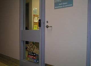
Meet Nelson - the Library Cat. Since he is displayed in a library window where both his front and back can be viewed, so he was constructed as a double-sided quilt.

To create Nelson’s sleeping place, I photographed a stack of medical books and recreated them in fabric. Fonts and their colours were selected in Microsoft Word to closely resemble those on the actual books. The letters were printed out on printable iron-on fabric. Each letter was cut out individually, a testimony to what a super sharp pair of tiny scissors can do. The lettering for the Merck Manual was printed out as whole.

Nelson’s welcoming backside features the page edge view of the back of his stack of books. His cat toy doubles as the quilt label.

To read more of Nelson's story and to find other Library Cats see Half Nelson.


Thursday, August 5, 2010

Half Nelson


All wrestling puns aside, this is indeed a half Nelson, since he is currently an “in process” quilt. This is Nelson’s front section, and when I unite it with his back section, plus a cozy stack of medical books upon which to sleep, he will become a full Nelson. So don’t worry about those pesky frayed edges – they will disappear in the seam allowances when Nelson is finished. Chances are he won’t even wake up.

Nelson is destined to become a Library Cat, and will take up residence in the window beside the door of the staff library at Timmins & District Hospital. He will take his place in history with all the cats that dwell in libraries around the world. Most of them are real living, breathing cats, but as you can see, Nelson is special, since he is flannelette. He won’t ever cause librarians to fret over the changing of his litter box. Nelson has adopted his very fine name from one of the most common and beloved medical library texts, the Nelson Textbook of Pediatrics.

You can meet lots of other Library Cats all over the world by going to
http://www.ironfrog.com/catsmap.html


But you won’t find Nelson there. At least, not yet.

Tuesday, March 23, 2010

Summer Vacation

Quilt No. 71
March 2010

I did a brief session at the guild on how to dye fabric with Setacolor dyes. I was worried about taking dye into a room where we would be showing finished quilts, so I kept my demonstration very small, using a 10x14 inch piece of fabric placed on a cookie sheet. We left the fabric to complete its dying/bleeding process on the top shelf of our library cupboard.

During our next guild meeting I pulled out the fabric, and we all admired it. Then came the inevitable question, “So what are you going to do with it?” Do? I had thought my commitment was fulfilled with the passing around of the dyed fabric. Suddenly it had the feel of an unfinished recipe. Sure the ingredients were there – but where was the completed dish?

It seemed to me that there were all ready far too many in-progress quilts floating around my quilting table. I would let myself turn the dyed piece into a quilt only if I could do it quickly. I decided to machine quilt it, since the sun was begging for the addition of flames. But what to add to this weird sunset? I thought about silhouettes, working my way through and discarding the most obvious ones, such as crows, gulls, herons, humans, palm trees, and horses. That left space ships. And so here you see a space ship bearing a friendly alien - an alien who is relaxing on his summer vacation.

Quilt Notes

The piece was sandwiched with Fusible Warm Fleece. It made the machine quilting with rayon thread surprisingly easy. A silk tie rescued from Value Village was used for the space ship and the binding.

Monday, March 8, 2010

My Mother's Prayer

Quilt No. 70
March 2010
Quilters are often plagued by UFO’s. They lurk around and slop buckets of guilt on us. But unlike the usual kind of UFO’s, which are Unidentified, Fly around, and probably house aliens with questionable intentions, the UFO’s that dog quilters are more benign. They consist of all those projects that got launched but haven’t yet reached the Nirvana of completion. They are UnFinished Objects. And they are mostly alien free.

My Mother’s Prayer is a UFO of a sort. Sometime around 1948 or 1949 my mother completed a cross stitch of the prayer, Now I Lay Me Down To Sleep. She was a young, busy mother at the time, and somehow this piece of embroidery never made it into any sort of frame that would allow it to be displayed. As Mom went on with other endeavors, other crafts, and other children, the piece got buried deeper and deeper, and was largely forgotten. Every few years she would come across it as it languished in a dresser drawer or a cedar chest. It followed her wherever she lived. I can’t even say exactly when it passed into my hands. I followed suit and stashed it in a drawer.

Recently, at quilt guild, a friend loaned me a book about making existing linens and embroidered pieces into quilted wall hangings. Eventually I connected the dots and realized that I could finally release my mother’s prayer from decades of seclusion and end its “UFO” status.
Quilt Notes

I found an off-white cotton that matched the embroidered piece reasonably well and added borders to make it larger. The outline and details of each embroidered child has been hand quilted. Likewise, the outline of each letter of every word has also been hand quilted. My initial vision for this quilt was one that included extensive quilting on the border. I spent a massive amount of timing trying to achieve that goal. When I finished it, I could see that this did not compliment the detailed embroidery - it ended up competing with it! I stared at it for weeks, trying to convince myself that it looked great. Or acceptable. Or vaguely okay. I finally gave in to reality. The quilting on the border had to be removed. Eventually I settled on an un-quilted border with a scalloped edge.

Saturday, December 5, 2009

Private Idaho


Quilt No. 69
November 2009
What would it be like to live underground “like a wild potato”? This question popped into my head when I heard the B-52’s song Private Idaho (see lyrics on right hand side bar). The song suggests that someone who is gripped by fear of the ordinary - patios, pools, “signs that say hidden driveway”- might be hiding in a lifestyle that mimics a potato tucked safely underground. What might this safe harbor look like? I couldn’t help but put my own spin on both the above and below ground life of such a marvelous sheltering potato plant.

This quilt features a hand-dyed sky. Each leaf of the potato plant was created individually and then sewn onto the quilt. A hummingbird visits the blooms at the top.

I drew each potato room on paper and then scanned it into a file. The files were then adjusted to create the high-contrast sepia tones. The potato rooms were printed out on cotton and appliquéd onto the quilt. All potatoes are connected by satin roots and are outlined in gold metallic thread. This piece is hand quilted.

Lyrics to Private Idaho
Written by The B-52’s: Catherine Pierson, Fred Schneider, Keith Strickland, Cindy Wilson, Ricky Wilson

You're living in your own Private Idaho
Living in your own Private Idaho
Underground like a wild potato.
Don't go on the patio.
Beware of the pool,
blue bottomless pool.
It leads you straight
right through the gate
that opens on the pool.

You're living in your own Private Idaho.

Keep off the path, beware the gate,
watch out for signs that say "hidden driveways".
Don't let the chlorine in your eyes
blind you to the awful surprise
that's waitin' for you at
the bottom of the bottomless blue blue blue pool.

You're livin’ in your own Private Idaho. Idaho.
You're out of control, the rivers that roll,
you fell into the water and down to Idaho.
Get out of that state,
get out of that state you're in.
You better beware.

You're living in your own Private Idaho.

Keep off the patio,
keep off the path.
The lawn may be green
but you better not be seen
walkin' through the gate that leads you down,
down to a pool fraught with danger
is a pool full of strangers.

You're living in your own Private Idaho,
where do I go from here to a better state than this.
Well, don't be blind to the big surprise
swimming round and round like the deadly hand
of a radium clock, at the bottom, of the pool.

I-I-I-daho
I-I-I-daho
Woah oh oh woah oh oh woah oh oh
Ah ah ah ah ah ah ah ah
Get out of that state
You're living in your own Private Idaho,
livin’ in your own Private.... Idaho

Wednesday, August 19, 2009

Crystal Blue Persuasion

Quilt No. 68
August 2009
It was 1969 when my best friend Jane and I first heard the song. We were sun tanning at the cottage, accompanied by the ever-present A.M. radio. Since that day I’ve always loved Crystal Blue Persuasion by Tommy James and the Shondells. It’s not only a great tune, it has a wonderful message of hope – perhaps there is still a chance for “peace and good brotherhood” among nations. My dear friend Jane is no longer with us, but when I hear the song I am transported back to those sunny days.
This song is one of those exceptional pieces of music that has the power to create superb visual images. The first image that emerges is, of course, that of blue crystals. I looked at pictures of crystals until I thought my eyes would turn to quartz. I drew gawky clumps of crystals for several weeks before I came up with a configuration that pleased me. These were then used as patterns. The fabric was dyed with Setacolor fabric dyes, including Shimmer Pearl, which added sparkle. The crystals were hand appliquéd onto the quilt, and the facets were outlined with embroidery in metallic thread.

But the crystals needed to look worldly. When discussing this feature with my friend Ruth, she suggested adding a globe of the Earth. I thought of adding a series of different phases of the Earth on to the crystals, but this proved too challenging. The crystals looked liked they’d lost in a marble swallowing contest. Eventually I decided that a map of the world spread over the crystals would give the effect I wanted. To add this feature, I traced a map onto the crystals. One at a time, I painted the continents with Elmer’s School Glue (Blue No Run Gel). This glue penetrates fabric and is very precise – it doesn’t wander into areas beyond where it’s been painted. I sprinkled Trichem Downyfleece (it looks like loose powdered fleece) over the glue and let it dry for several hours, then dumped off the excess. The fleece adheres only to the glue-painted areas and forms a very durable bond with a clean edge. Where did I find this product? Ironically, I’ve had it in my craft stash for over 25 years – ever since I got it from my friend Jane.

The words “crystal blue persuasion” always suggest great expanses of blue water to me – or maybe that’s just latent heatstroke from listening to the song in the hot sun. I wanted a visual element of the Earth as a globe, so ocean seemed the natural choice. Dolphins, killer whales, and other marine life were added to take advantage of the crystal blue water.

The lyrics called for “children of every nation.” This seemed like a pretty tall order, especially the “every” part, so I settled for only a few representative children. I drew the figures, transferred the drawings onto cotton, and embroidered them by hand in satin stitch. Each child took a few hours to complete. Each figure was then fused to another layer of fabric, and then fused onto the quilt.

The waves and the quilt binding were dyed in various blues to finish off the quilt. Small music symbols are featured on the binding fabric. The song lyrics are reprinted as part of the label on the back of the quilt. As a final touch, clear beads were added to the stars on the background. A new day is dawning – but not quite yet.

I think Jane would have liked this quilt.
To read the lyrics to Crystal Blue Persuasion, check the sidebar on the right hand side of the page.

Lyrics to Crystal Blue Persuasion
Composed by Eddie Gray, Tommy James, and Mike Vale

Look over yonder
What do you see?
The sun is a'risin'
Most definitely.

A new day is comin'
People are changing
Ain't it beautiful?
Crystal blue persuasion.

Better get ready
To see the light
Love, love is the answer
And that's all right.

So don't you give up now
So easy to find
Just look to your soul
And open your mind.

Maybe tomorrow
When He looks down
On every green field
And every town

All of this children
Every nation
There'll be peace and good
Brotherhood

Crystal blue persuasion.

Monday, July 13, 2009

Quilt Show At Timmins and District Hospital

Eleven Concept Quilts created by Julie Domenico are currently on display in the Artist's Promenade at Timmins & District Hospital, July 13 - August 21, 2009. These quilts, collected together here as Our Beautiful and Terrifying World, illustrate the contrasts in our world that we take for granted. Wildlife and landscape quilts are featured along with quilts representing themes based on war.


Saturday, May 2, 2009

Origins of Life

Quilt No. 66
April 2009

The black velvet acacia tree featured on this quilt serves as a back drop for jewelry owned by my mother, my mother-in-law, or me. Several layers of gold or orange organza stretched over a layer of pale orange cotton were used for the background. Chains from necklaces outline all outer parts of the tree as well as the boundaries in the background. The jewelry ranges in age from one to fifty or more years, and includes a rhinestone necklace from the 50’s or 60’s, charms, pins, earrings, and bracelets. A Ten Commandments bracelet that was given to me around 1960 can be viewed on the mid- to lower-right of the tree.


Quilting Notes


All jewelry items were sewn onto the tree using ”invisible” thread (MonoPoly from Superior Threads). Only a minimal amount of hand quilting was added to avoid “wrinkling” the organza.


Tuesday, April 7, 2009

Mexico: Beyond the Reef


Quilt No. 65
March 2009

In January 2009, fabric proved difficult to find during a trip to Mexico. A cotton beach cover up was purchased in Playa del Carmen. The material was used for the dolphins and the flowers on this quilt. A 320 peso ($3.20) necklace was purchased and plundered for the white shells used to create the tall flowers.

Quilting Notes


The dolphins were fussy cut and heavily stuffed, trapunto style. Glass beads were added along the length of the dolphins to accent the sparkle of the background fabric. The tall flower stalks were created with wool. The flowers were also fussy cut, hand appliquéd, and decorated with glass beads. Silver metallic thread was using for the hand quilting.

Saturday, January 24, 2009

Hibakusha

Quilt No. 63
January 2009

The hibakusha can only stand and mourn as radioactive fallout destroys their lives and their city. Their clothes have been burned off. Waves lap up around them in the dying city of Hiroshima, a city that is crisscrossed by many rivers. Flames will consume the city, and those who seek refuge in the waves of the rivers will succumb to the fire storm. Hibakusha, literally translated as "explosion-affected people", is the Japanese word given to the injured survivors of the atomic bombings of Hiroshima and Nagasaki.

August 6, 1945 was a calm and sunny morning in the city of Hiroshima. At 8:15 the atomic bomb, Little Boy, was detonated over the city with a blast force equivalent to 15,000 tons of TNT. Within minutes 80,000 people within a half mile of ground zero were dead. Many more would die; injured survivors would become the hibakusha.

As the citizens tried to make their way in their ruined city, many became sick and died. Had they been attacked by a new chemical or biological agent? They were unaware that a nuclear weapon had been detonated. No one was familiar with the specter of atomic bombs or their aftermath - radiation sickness. Little was known about the effect of radiation at that time, and the disfigured and ill survivors, the hibakusha, experienced severe discrimination. Feared as carrying a contagious or hereditary disease, they were often denied jobs and marriage partners. Although medical science gradually revealed the cause of their illnesses, the negative attitude towards the hibakusha continues even today.

This quilt, with its post-apocalyptic setting, depicts a small part of their story. The red-crowned crane flying over the scene is a symbol of long life and fidelity, or of luck and peace. In Japanese folklore this crane is said to live for a thousand years. Today, it is a highly endangered species with less than 1,500 birds remaining in the wild.

As of March 2008, there were 243,692 living hibakusha in Japan. Their average age was 75 years. Memorials record the names of more than 400,000 hibakusha in Hiroshima and Nagasaki. Many more names are added each year.

Quilting Notes

The border of this quilt is one solid piece, with the figures and city viewed in a central “window.” One figure was hand drawn and repeated with minor variations to create the groups of hibakusha. The human figures were done in appliqué and outlined with hand embroidery. The city was created by dying various fabrics in slightly different shades, and fusing them to the background. Buildings were then outlined with embroidery. This piece is hand quilted.

Saturday, December 6, 2008

Quilting in the Wind


Quilt No. 62
July 2008

This quilt was inspired by a session of fabric dying that took place under less than ideal circumstances. A friend had given me a magazine that outlined a dying technique where strips of tissue paper are placed on damp fabric. Setacolor fabric dye is then painted over the strips, and the dyes from the tissue paper and the Setacolor run together to create interesting patterns. The process is done outdoors, as Setacolor dye is light sensitive.

I set up my work area on a table on the deck of our cottage. I was very enthusiastic about trying this new technique, so I ignored the fact that it was a very hot and windy day. Dying fabric with Setacolor paints requires limited air movement and high humidity to allow time for the dye to spread out slowly before it dries. However, as the wind blew fiercely, the tissue paper strips kept blowing off the fabric. The fabric kept losing its required dampness, so I didn’t chase the strips, I just kept spraying the fabric with water and adding new strips of tissue paper and more fabric dye. Eventually, I left the project to dry in the sun. As I made my way around the corner of the deck a new vista greeted me. All the strips that had blown away were hanging in the trees – in effect, I had “toilet papered” my own trees with messy strips of dye-laden tissue paper. When I related these events to my friend, she immediately suggested this would make a good subject for a quilt. Her comments became the inspiration for Quilting in the Wind. The tissue paper dyed fabric was used in the quilt entitled, Uncharted.


Quilting Notes


Although I tested several brands of tissue paper it was all dye-fast, and did not release any dye. It did however causing varying effects by blocking the sunlight to different degrees in different areas. The design of the tree trunk was “borrowed” from a drawing on the internet, but I drew the branches and leaves. A small amount of fabric was dyed to create contrast near the base of the tree. Purchased “transition fabrics” were used to get the gradations in colour for the sun and the pink strips.

Let It Be

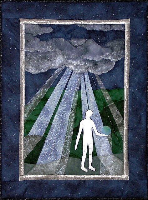
In Let it Be we see a figure holding the planet Earth in his hand.

Despite the cloudiness of the night sky, beams of light break through.

In his famous song, Let It Be, Paul McCartney wrote

And when the night is cloudy
There is still a light that shines on me
.


Quilt No. 61
June 2008
McCartney wrote this song after a dream about his mother, Mary, who had died many years previously. In the dream, she soothed his tensions, advising him, “It will be alright, just let it be."
Often, during our darkest moments, someone will step in to shine a light and show us which way to go.

When we have learned to accept that there are limitations and situations beyond our control, we will have learned to let it be.

Is the figure divine? Is it human or alien? It’s up to the observer to decide.

What a world we could have, if we could learn to let it be.

Quilting Notes
I wanted to use some sheer material in this quilt as part of the beams of light. This proved to be exceptionally difficult, as various types of this fabric shredded along the raw edges when I tried to sew them on. Gluing them simply made a mess. The raw edges could not be turned under, as they would show. Eventually I found a fabric that could withstand stitching along the edge with invisible (nylon) thread. A different sheer fabric was layered over the star fabric to give a dreamy quality to the light beams. The central figure was put on and removed a number of times, as the tight curves and the thick material (two layers of cotton to hide any seam allowances that were turned under) made appliqué very challenging. The cloud and the figure were both painted with Setacolor Shimmer Pearl prior to being added to the quilt. When assembled, the quilt was much too dark. Additional Shimmer Pearl was painted on the finished quilt to give a much lighter look.

Waiting for Death


Quilt No. 60
June 2008

I noticed a crow was spending a lot of time in our back yard. Oddly, he didn’t fly away when I went out on the patio. He seemed to be injured, and began to spend his time sitting on the edge of the wishing well, gazing off into the distance. He could no longer fly and seemed resigned to his fate. I took a photo of the crow, knowing I would one day use it to create a quilt entitled Waiting for Death. His life seemed to parallel events in my family as my elderly mother declined and approached the final challenges of her life. The title seems bleak, but the crow is surrounded by tremendous beauty as he prepares to pass from this world to the next.


Quilting Notes

Black polyester-cotton was used for the appliqué of the silhouettes. One hundred percent cotton, particular black cotton, tends to be thick and coarse, and shreds along the raw edges, making it more difficult to use for appliqué. The cotton with polyester is smoother and thinner and gives finer edges that are more easily turned under. The background was dyed the Setacolor fabric dyes painted over tissue paper strips. A minimal amount of hand quilting has been added.


Friday, December 5, 2008

Crikey!


Quilt No. 59
February 2008


I have a message for my fans. Whatever you want to do in this world, it is achievable. The most important thing that I've found, that perhaps you could use, is be passionate and enthusiastic in the direction that you choose in life, and you'll be a winner.
- Steve Irwin, 1962 – 2006


It took a long time after conservationist Steve Irwin, the Crocodile Hunter, died on September 4, 2006 before I did this quilt in his honour. I’ve shown only his feet and legs plus a crocodile. This simplistic view of this passionate man is how I always think of Steve Irwin.

Quilting Notes

I probably looked at every one of the hundreds of pictures of Steve Irwin posted on the Internet when I was trying to find one that showed his feet in the position I had in mind. It needed to be clear enough to use as a template to make the fabric pieces for the boots. I searched a number of times over several weeks and came up with nothing that would be useful. I also looked at all kinds of pictures of work boots and hiking boots, but these weren’t right either. One day, I used “Crocodile Hunter” rather than “Steve Irwin” in a Google Images search, and found a picture of the Crocodile Hunter Action Figure. The feet were in the position I wanted and the details on the boots were very clear. I used this to create his boots and legs. The fabric for his legs was tea-dyed to give them a typical Australian tan. The green lawn he’s standing on was a piece of fabric I had dyed previously. It was the result of using up leftover powered plus liquid dye from an exploration that didn’t work out. Quite by accident, it was the right shade of green to match the fern and river fabrics in this quilt. The crocodile and fence fabric were in my stash, so it wasn’t necessary to purchase any new fabric for this quilt. The fence was also tea-dyed to give the original flat grey colour of the fabric the appearance of wood.

The outline of the crocodile came from the logo of an alligator that appeared on the plastic mailing envelope from a medical journal that I received at work. It was used to advertise an upcoming conference in Florida. I liked the outline of the alligator and kept it pinned up on my bulletin board for many years, with no particular use in mind. When I made the pattern, I narrowed the snout to make it look more like a crocodile.

The fence was added to bring things into focus by reducing the impact of all the green fabrics so they wouldn’t overwhelm the quilt. Every rail in the fence was outlined with embroidery floss. I used only one strand of brown for the top of the rails. The depth of shadow below the rails was increased by using two strands - one brown plus one strand of a red that matched the colour of the crocodile.

I made this quilt for my co-worker, Pierre, to thank him for all the hours he spent making and arranging the purchase of the business cards for Concept Quilts, and because Steve Irwin is one of his heroes, too.


Logo from envelope


Original concept drawing

Resting Place

Quilt No. 58
December 2007

I kept envisioning a quilt with a bridge and a park bench in a green and restful setting. I combed the Internet for a picture of each, and and rescaled the photos into patterns to use as separate elements in Resting Place. Although my original drawing included a weeping willow tree I didn't add it in - it simply overpowered the other objects. Instead, evergreens were placed in the foreground to frame the scene.
Quilting Notes

The wood grain fabric of the park bench was dyed slightly darker than its original shade to give it a nice warm appeal. Each "board"of the bench was appliquéd onto the quilt individually. I traced an outline of the bench pattern onto a piece of transparent plastic, and laid this on top of the quilt so that I could accurately position each board before sewing it on. This has proven to be a very useful technique for positioning intricate pieces.

I machine-quilted the bridge prior to sewing it onto the quilt. The river was machine-quilted after the quilt was assembled. Everything else on this quilt was hand-quilted.


Photo used to create the bridge


Original concept drawing

Thursday, December 4, 2008

Looking for Atlantis


Quilt No. 56
October 2007
Looking for Atlantis was a “challenge” quilt. One weekend I had taken my usual vast amount of quilting tools and assorted fabrics to the cottage to work on a specific quilt. I was so focused on trying to remember everything I might need that I actually forgot to bring the quilt that was currently in progress. Faced with a weekend of not quilting at all, I challenged myself to use the limited fabrics from the 3 or 4 projects that were in my bag, and to see what I could come up with. The waves, fish and mer-people were “fussy cut” from various parts of one piece of fabric. The central rock in the background was from a piece I had dyed earlier in the summer by spreading light-sensitive dye on the fabric, scattering sand over it, and leaving it to dry. As the subject of this quilt emerged, I knew that I would use it as a gift for my daughter who spent much of her childhood reading about Atlantis. She is still convinced that if we look hard enough, we can probably find it. I think it is quite likely that she is right.

Flight of Fancy


Quilt No 55
May 2007


The central hot-air balloon in this quilt was scaled up from a picture in a small calendar. The colours were so vibrant that I thought it would be fun to recreate them in a quilt. I designed several smaller balloons to go with it. Composing them in a suitably random and realistic manner was extremely challenging. I struggled so much with this project that I wanted to name the quilt A Nemesis of Balloons, but that proved to be an unpopular choice, and so it became Flight of Fancy.


Quilt Notes

The large balloon is done in appliqué which became increasingly difficult as the coloured strips near the balloon's edge became narrower and narrower. The other balloons were made of tiny pieces fused onto white cotton and then appliquéd onto the quilt.


The original photo came from a calendar

Uncharted

Quilt No. 54
May 2007

This is a tribute to the explorer Ernest Shackleton. In this quilt we see the silhouette of a ship that is exploring in Antarctic waters, with the high cliffs of glaciers in the background and the sea in the foreground. The ship was scaled up from a picture of a three-masted barquentine, the type of ship Shackleton used on his Imperial Trans-Antarctic Expedition in 1914. While there are many photos of his ship Endurance there are none that give a simple view of it from the side. Another ship of the same style was used to create the pattern.

Quilting Notes
The sea was dyed with Setacolor fabric paint and overlaid strips of tissue paper. The fabric used for the glaciers was dyed with the leftover paint. Cotton embroidery floss was used for the rigging.


Original graphic used to create the pattern pieces for the ship